T
here are two fundamental questions that people face to when they are going to create a presentation. These questions come from different origins but aimed to understand how to create a slide. Here they are:
What content to put on a slide? and How to put tons of content on a single slide?
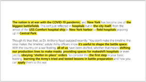
In this article I’ll show you the answer to the second one and will lead you through the process of content reprocessing step by step. Actually, almost any piece of text can be transformed into a visual message. So, here is our experimental tonne of content taken occasionally from Forbes news article:

The 1-st step
You need to define anchor words which are used to tell the key idea of our future slide. See how it looks for two bricks of our text:

Try to read just the highlighted sentences. There was nothing important lost, wasn’t it? You’ve spent twice less time to read but still got the original idea. Moreover, as of now I can state the key meaning of our future slide devoted to these paragraphs:
The nation is at war and you should learn Army’s lessons to fight.
The 2-nd step
You should build the graph that will subsequently link all of anchor words we’ve found before. That’s how it will look for our slide:

Now we can follow this train of thought from statement A to statement B. We could state our key idea only and add emotional photo of todays New York to prove one and this would be the the ready-to-go slide. But we will go further and make our idea persuasive and proven by mid-staged ideas.
The 3-rd step
Doing this step we will use text size and probably text color. We need to do the following:
- To focus attention on the most important content and to background the less important.
- To shorten sentences up to no more 3–4 words in the sentence.
Two these actions will allow us to switch reading function of our brain to perception of visual forms, objects, structures, etc.

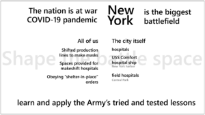
It is the almost final slide content which can be sent to design production. There is only one thing left to do.
The 4-th step
Make design work simple or share your creative ideas with presentation designer. That’s how our test brief slide visual solution can look like for this content:

A professional designer will do the rest. What is the difference?

Texts take much time to read and activate logic thinking to get an idea. Slide takes little time to read and to get an idea. It also activates visual perception and emotions instead of logic part of our brain. Use this workflow anytime you need to simplify text massive into short and clear message and you’ll have success with your slides everytime!


