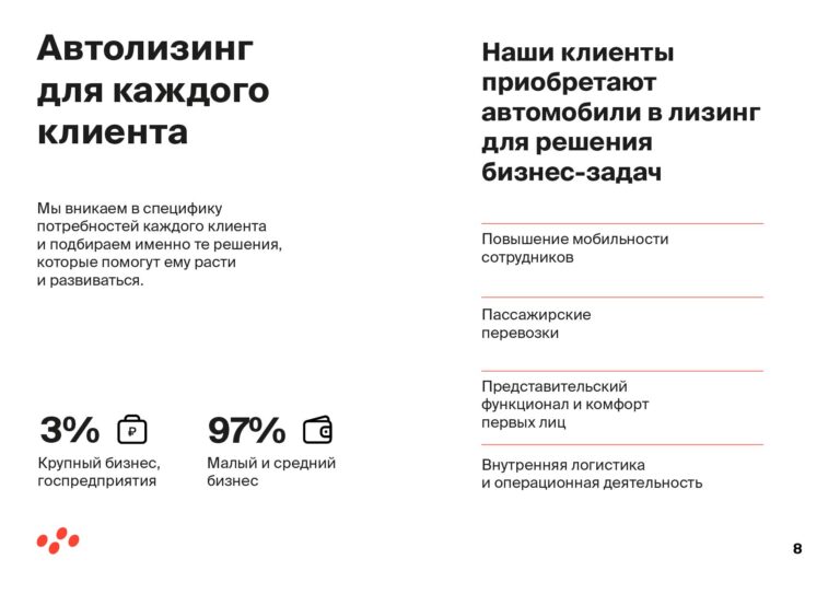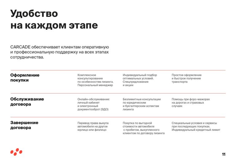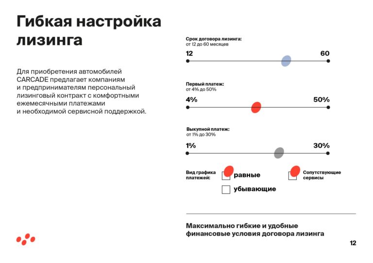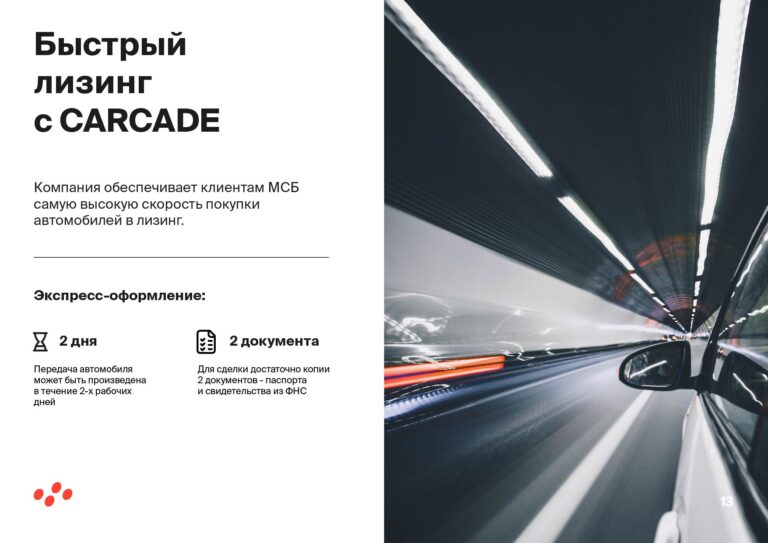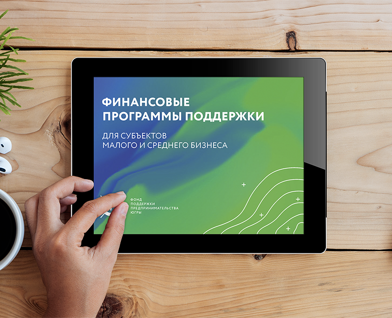
Presentation of company
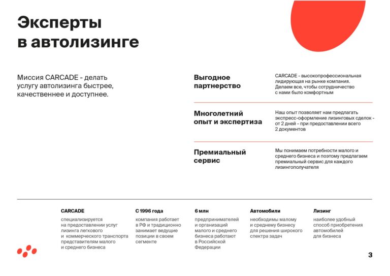
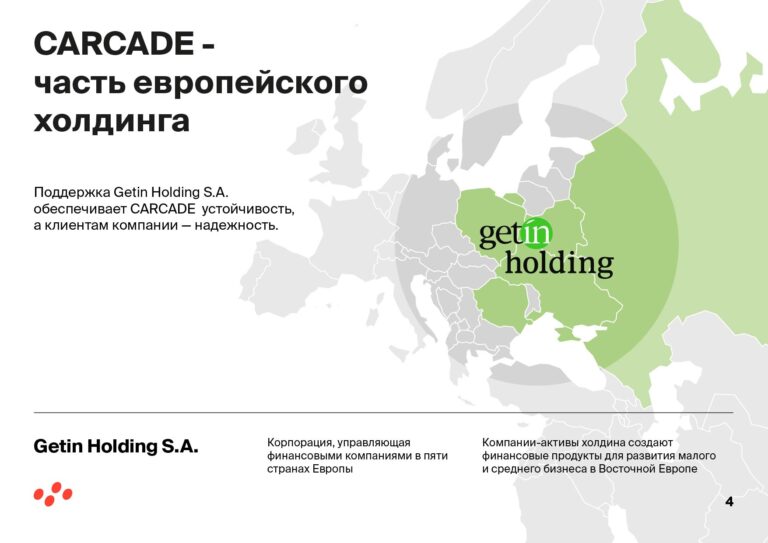
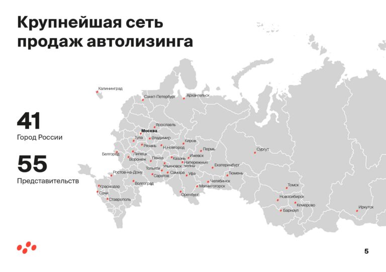
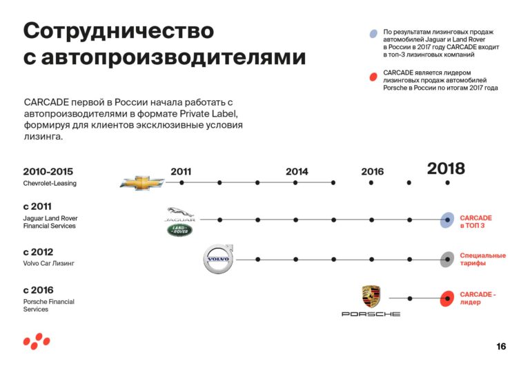
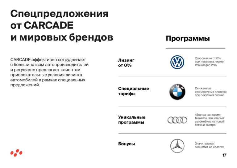
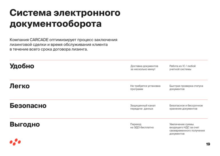
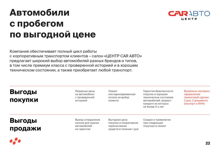
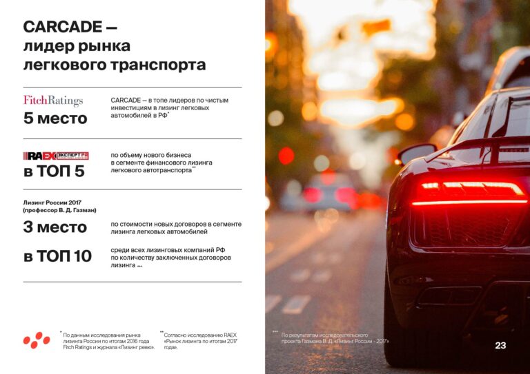
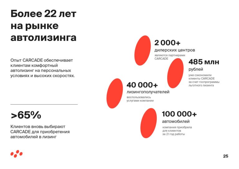
T his presentation is one of numerous projects we done for CARCADE leasing company during years of partnership. This time we solved the task of presentation redesign according to new brand identity. Since of now, we definetely know, that all the rest of marketing materials look modern, stylish and aligned with company brand.
This project is a good example of corporate “european style” presentation, which is commonly used by big companies.
- We recompozed texts on each slide
- We aligned slides design style with brand identity
- We designed the rest of slides of presentation
- ClientCARCADE LEASING
- IndustryCar leasing
- ServicesArt Direction, Slides design, Infographics
- FormatPDF for digital use
Project task
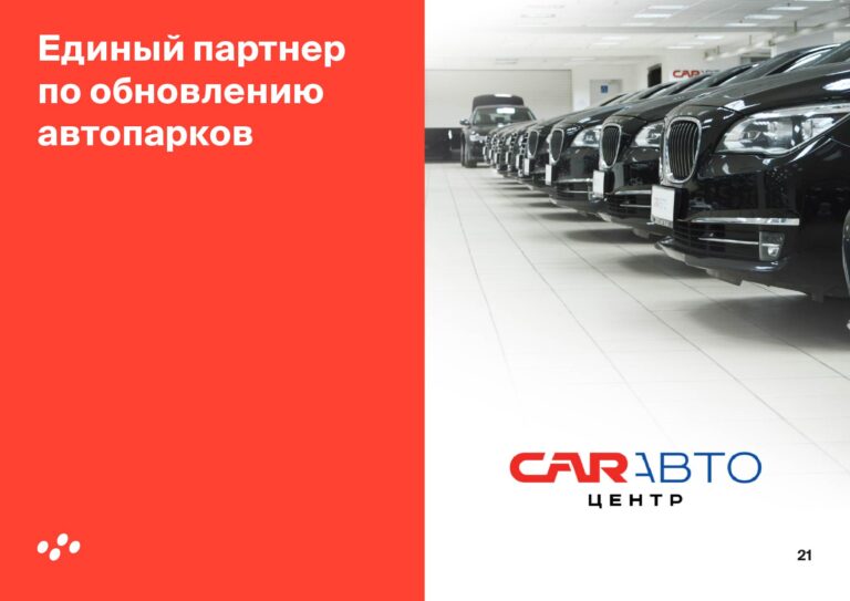
Despite presentation for CARCADE Leasing company was based on ready-to-go texts and slides structure, it took pretty much time to adapt new identity solutions specifically to slides layout and design. The more minimalistic visual solution we have, the more difficult to deliver the information with this minimal set of elements and primitives. In this project we used color, line, oval, photo, and three sized font. This set is quite enough for a corporate masterpiece.
Start point
